Where we started
Inspace is a virtual learning platform that combats zoom fatigue and offers and innovative alternative to traditional online education and classrooms. Our job was to update their logo and branding system to reflect their authentic voice and stand out in the industry.


Where we landed
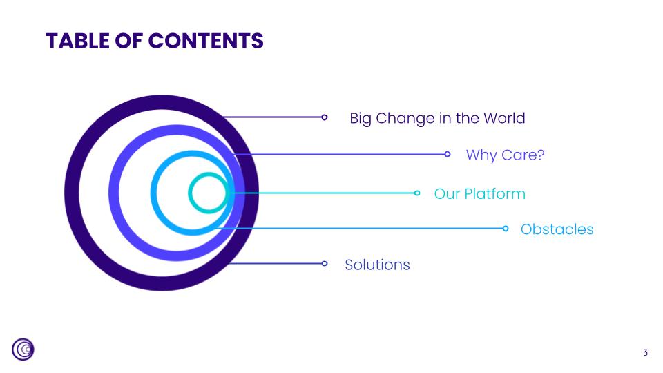
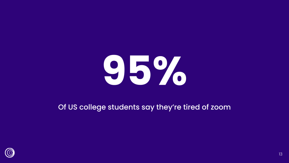
I collaborated with the team at Caveat LLC to create a new comprehensive brand system for inspace including logo, slide template, brand guidelines, color palettes and other visual assets.
How we got there
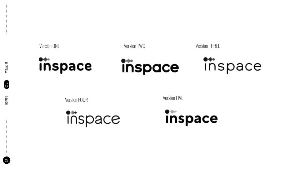
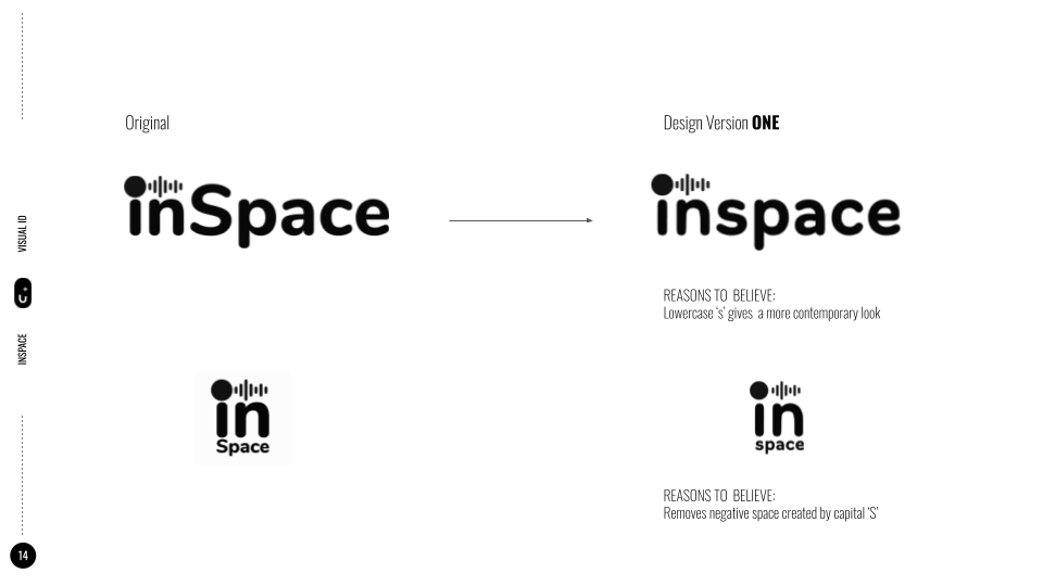
It all started with extensive font and logo mark exploration. The client wanted to maintain some elements of their original logo, so we experimented with the existing forms. Stretching, bending and reimagining, we landed on a modern, concentric circle design.
COLOR
Once the client was satisfied with their new logo, we moved into color exploration. We went with a cool, analogous palette.



BRAND GUIDELINES AND TEMPLATES
The team then worked on a full brand guidelines and branding kit for inspace to launch their new brand. My focus was on creating a presentation template using the new assets and brand guidelines. You can view the inspace website with updated branding here.
